Sunday 24 April 2011

Shot 4 Progress


Erm.. not much to say but.. I think the heats getting to me.. the bricks were suposed to be yellow - orange like colours, but then they turned purple.. then some how.. they've managed to set on fire so.. they're red now!...lol...... I've tried my best to keep the design constant.. so that it follows through to michelles brick design.. shall work on this again tomorrow after getting some rest ... This heat... is seriously draining everyone =(

The Last image is with the cutout effect.. =D

Thursday 7 April 2011

more fix ups!


Shot 5 Improvements


For shot 5, As you can see, its only a few bricks, HOWEVER, the lighting is actually pretty complex..

With colour^^

With LE SKYYY

Matts advice in improving/

With a NEW sky and a slight outline to make ithe bricks standout more.
How CUTOUT ruined it.o.O

Feedback from Matt^^


It seems, from the last feeback I went a bit crazy with the perspectives! So thx to matts very detailed feedback Im managing the perspectives very well, by following the guidelines! Warped pictures are becoming more challenging as I've increased the size of the canvas. Its much longer then I originally expected it to be, probably why the bricks on the right seemed a bit OTT.. I didnt bent the perspective line.. exaggerating the curve to a point where the bricks looked as if they were falling..lol..

so yeah!

Matt:
Haha hey Yuki, I got a bit carried away drawing over your pics with edits, so don't get too hung up on what I've written, I was trying to help myself work it out and think so...

PART MISSING - you will see the result in another post.. =P

Sorry bout the knitpicking. These aren't big issues, just what would be ideal and if you can make the changes then great, but if you're having trouble with them then don't worry, they should work fine as they are.

Thanks, see ya.
____________________________________________________________

Thx Matt =DD

Tuesday 5 April 2011

Shot 5! OK'd!


Back to SMITTEN shots =D

Shot 5 above

Shot 3 Panning.....shot


Shot 4

Drawbridge! =D

Frame Painting for the opening shot continues!

heres the full details of which I've been instructed to follow.
Okay so crunch time coming monday Yuki- its gonna be a tough few days for us but I'm sure we're up for the challenge!

so for the environment painting here's what I want- remember when you did this:


http://3.bp.blogspot.com/-ENZ8lX14MJE/TYIMFbUFzXI/AAAAAAAAAY0/Oaq1uwpmjqo/s1600/flowerpractice.jpg

This is the standard I want for the environment of our film for the 1st shot! Perfect referencing from a chinese painting - really strong sense of style.

The rock painting you showed me on skype was good- but I know you can do better, as I feel it was missing the strong sense of style and definition that you had in the above art piece.

Here's a rock painting i want you too reference from as closely as possible for the environment-apart from altering the colour slightly to suite the colour scheme we're working with:


Note how the artist works with the texture perfectly, make sure you use the texture as you're painting- i noticed it wasn't in the background of the file you sent me- I'll send you a paper texture file thats the exact correct size settings but test it when you import back to programme anyways.

work to our colour scheme as you have been doing- especially with the pond- making it that swamp style green- here's a pond that I think would make a lovely reference:


maybe a bit too faded into white but you get the style

For the plants use that nice depth of field you had with the foreground and background plants in your shot for smitten.

Weather you want to include a sky or more plants behind the pond is up to you, see what you think works

(Your frame paintings fine so I have no suggestions for that- just make sure the flickering is nice and soft so try and paint in a similar style for each frame).

And thats it!- check your hotmail for the paper texture and I'll skype you when I get home tonight to send you the 1st shot.

Iredia

Professional Skills

THE GANT CHART,Its physically too long to upload here
I decided to make one since we were given the option, and plus, I had trouble logging into shotgun half the time =S .. wasn't sure if what I had there was enough, so to avoid Shotguns technical problems, I made a gant chart for easy marking and tracking. Both my leaders pretty much already knows my full schedules so yeahhh..

.... as a note, I scheduled from ..

-SEPTEMBER 2010 to the beginning of term when we pitched.
-New Groups, Events Tasks to DECEMBER
-HOLIDAY SCHEDULE!
-SECOND TERM SCHEDULE - Mostly Filled with disso and tests.. and developing overall styles of the two films.
-HOLIDAY TIMETABLE
-IPP.................
-THIRDTERM SCHEDULE
-PLUS.. the 10 days I have to leave right before submission..for personal reasons/

I have to go HongKong for that week... reason why I've planned to work ahead of schedule, pushing tasks back in my gant chart so that there is time to fix or if our miscalculated, or underestimated tasks. If discussed this issue with my project leaders! And if I could I would really prefer to stay for that week, but its unavoidable! I really don't want to put so much pressure on my team members so I'm working extra hard this holiday to fill in the 10 days I'm not here. I may turn up at the start of third term like a zombie whilst everyone else look brighter and energized from the long rest they've had.. but owell. Things need to be done!

Im also going to BAFTA's! =DD For a bit of Industry networking maybe? Hope it will be a good experience^^

DISSERTATION

COMPLETED!! =DD NO MORE READING HISTORY!!!!^^

Frame Painting for MAYFLY

I have managed to frame paint a total of 1500 frames in two days, I say two days, it was probably a days worth separated between my sleep. HEALTH AND SAFETY, NEVER DO IT AGAIN!! Very Painful back and shoulder from it, I set myself a deadline of 3 days to a whole shot, went a bit OTT... and lost track of time.. Underestimating the workload was truly a mistake!

From this lesson, I have decided to take a break every 30 mins so I don't kill myself in the process, no point in rushing OR making team members worry over me. But I have also learnt, I can do around 500 comfortably now, so at least I have an idea of what I CAN physically archive. =D

with or without outline test


waterTest As scheduled

As scheduled, I did a watertest.. going over iredia's water test, The effect isnt so bad, although, Im hoping to add some more colour.. the water seems to be missing something.


The result of this test was suprising, there was many people who loved it! And found it so amazing! Gave me a sense of pride, working on the only two teams doing 2D animation =) It felt as though we were actually getting somewhere! With that said.. Dissertation.. drained our souls with words... =_= ...never again will I write so much in one go... =_=
Heres the reference:

New Nymph Character Sheet


I made a few changes to the character from the original sketch Iredia did.
-The face is now properly proportioned - so that's now a perfect front view.

-The back of the side view and front has also been changed. I felt the back of his head needed to be more round to represent a skull? The shape before seemed a bit o so i made it rounder.

-As discussed, I have given the character a faded water look to give him a slight bit of texture.

-Ive also given him a tint of red..mahogany like texture to his eyes to bring some life out. His legs were drawn with a calligraphy brush, it not only gave a unique texture but also a very unusual shape =O

Forest PanShot Progress


Heres a close up of the level of detail there is in the foreground. In reference to 
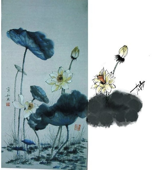
Le Royaume , Howls Moving castle, and the use of filters influenced by Michelle!! The flowers have a total of 5 tones which gives it that paper like realism . I spent a good 3 hours on that one rock. It was a challenge that I brought upon myself to archive a professional skill in digital painting. I feel as though I've stepped up a level in Digital Painting purely through practicing and observing!!^^

Digitally painting tends to make peoples creatively stiff at first, but since I've spent so many hours in these softwares it really shows how fluent my brush strokes have become! Using 3 different painting softwares at once has made me gain more confidence in my skills, and the use of my graphic pen!

I was getting a bit lost in the tones of colours we were using, even with a colour palette, since the forest pan deals with the outdoor lighting it becomes more complex! Especially the forest area, in comparison to the empty-ness infront of the castle. I've discussed this issue with Matt our project leader and it seems as though I'm still on track, so there was nothing to worry about in the first place.

As decided, TEAM SMITTEN will be using a cutout filter for a more unusual style. Its also the border that combines my backgrounds and Michelles backgrounds together as one style. We remain challenging angles within wonky perspectives for a more abstract atmosphere. So the process of our planning is them extended, but the outcome truely outstands our past conceptual pieces. Heres The Forest Pan with different levels of filters, We've decided not to destroy the efforts of foreground detail, and dismiss parts of the sky so that the overall art isn't cluttered with the same filter. By using different levels of the filters, we archive a more 3D, FLESHED out background, instead of a pure paper cut out.

This is not the finished piece.