Sunday 12 December 2010

Le Royaume


I was going through the TVPAINT Gallery where I stumbled upon LE ROYAUME once again, the gallery was FILLED with TVPAINT users creations. Its surprising I actually found what program they used, (for SMITTEN). Its been a long hunt but I did it!! After trying to study god knows how many layers they used, and HOW they com posited it all together. Its really amazing, I have higher hopes for "Last Day of the Dayfly", and I've gained more confidence in my analysing abilities! We came up with an alternative way of producing something SIMILAR to Le Royaume without using the same software. So I"m proud we took on the challenge, it feels like we've achieved alot from this term already!

Truly a great find =D

Tuesday 7 December 2010

Castle sheet! =D

I noticed we didn't have a finalised design for the castle! So I asked Matt if I could design it since I've been given the following tasks to do for the week...

(1)Put a character in a scene - coloured to add to our concepts folder
(2)Some interior shots of the dining area - we only have the one Michelle drew.
(3)FURNITURE design sheets - I'll be studying different designs, drawing a long sheet for us to finally decide what kind of varnish we should use for our interiors.
(4)Castle design sheet!
(5)Maybe watch "Merlin" for reference - suggestion from Michelle =D

So heres what I've come up with this morning^^

I wasn't sure if the princesses balcony was better round or square with the good old wooden beams. Since in during the medieval times, wooden beams were seen in between the blocky rock structures. So, I'll leave this to our comrades to decide on. Then I'll redraw the finalised designs.
=D

Friday 3 December 2010

First Concept!! For Iredia!

Computers not working 100% but I got a test done =D


I'm currently working on getting the authentic look, trying to imitate this digitally really is hard work! Having to imagine how water would react the each stroke and stuff.. very deep thoughts since I know the actual processes I have to go through if I did this traditionally.

I played around with some colour, made the pinkish grass a bit too bright. I have to refrain from using bright colours.. total opposite of what I'm using for my other projects, so its going to take some time getting used to. Overall, I was pretty happy with the outcome of the mayfly. The colours might be a bit too bright though, so more tests needed! Will keep you update in the next few days!

Tuesday 30 November 2010

Chinese Painting the old school way..

I found a video with someone grinding the block of ink and doing a bit of painting^^ Hope this helps you visualise what I was going on about in the previous post =D


This person isnt very "PRO" .. I think he or she is still in the middle of learning. I remember my chinese painting teacher had stacks of books with step by step instructions to help guide us along with the lessons. The person in the video has probably had alot of experience in acrylic painting since he/she uses very dark tones. Dark blocked out tones arent commonly seen in skilled craftsmanship.. that what people believe anyways.

They people running the channel seems to have an aim to animate chinese paintings =O So I guess this was a great find!! I should contact them to see how they're progressing, We might be able to snatch a few tips on the way ^^

MORE WORK!^^

I've been asked to work on a very nice project over the weekend. Iredia, from our course asked for my my assistance. Thanks to the past tests I've been doing in SAI for the past few weeks, people seem to be gaining interest in my new found style^^ Which is always a nice thing, I'm gaining my confidence back, the confidence I lost during my second year at Ravensbourne. Having members of my team believe in my work is truly a boost of self esteem.

I would also like to thank Michelle especially, we seem to have this mild rivalry thing going on, helping each other step by step; thats making us broaden out more in our own styles. So we're both dishing out new techniques every week! And exploring so many more different styles! Its a great motivation, keeping us moving^^ So THANK YOU!! =D

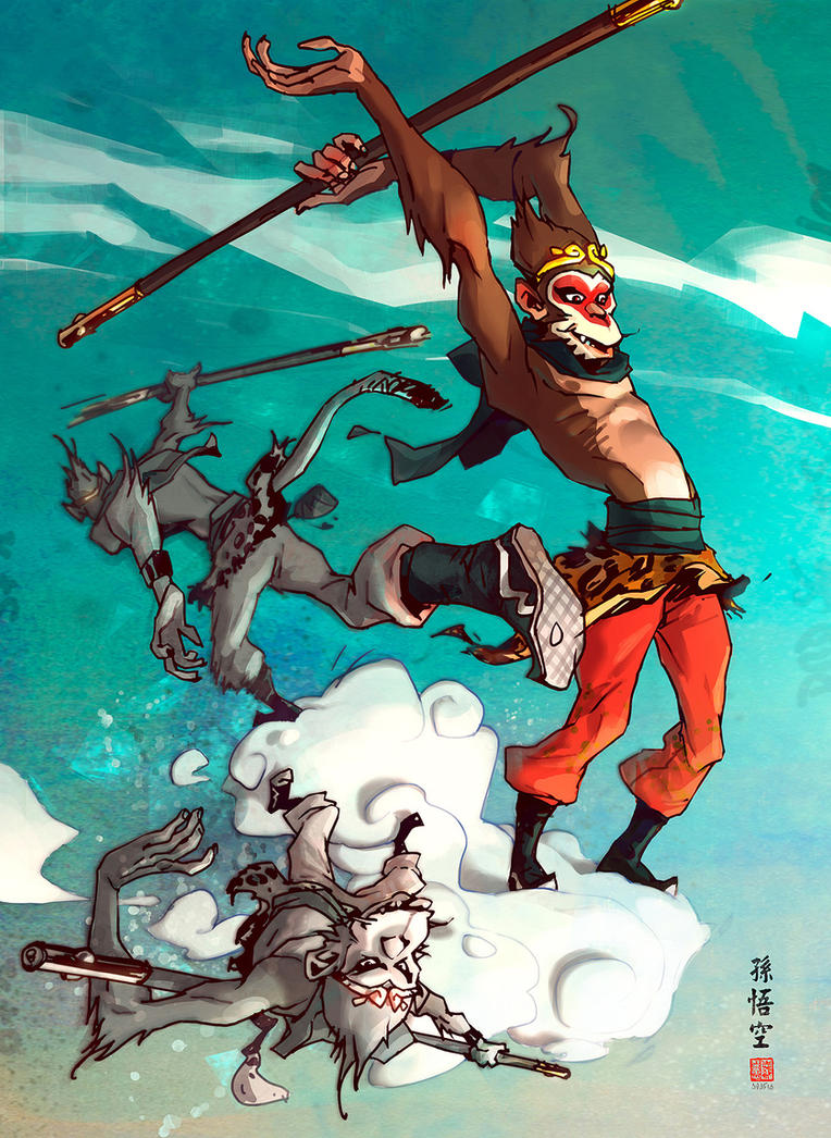
Anyways.. I've been asked to work on CONCEPT work, as a cinematographer. Which is such a nice thing, since that IS my target this year! I'm glad someone has seen potential in my skills. I've been asked to study closely with chinese paintings. Something I was forced into in chinese school, a LONG time ago. I used to get really high grades actually, but that was using a traditional paint brush, playing with water and ink, then a splash of COLOUR paint. It was very hard to do at first but yeah. Iredia wants to explore a more ORIENTAL style for his 30 second piece. Its a very simple piece, yet it carries values with so much more meaning. I'll post up the script after finding it through my inbox. After evaluating the whole plot with Iredia the other day, then going through the character designs, I felt a boost of excitement. I could actually picture each scene very nicely. Iredia has already mentioned hes a very flat out kind of person, and finds it very hard to picture things in more dynamics views to give shots that push. So I'll be playing with many angles, and working alot with the lighting. I pictured a very nice moon scene, with the reflection of the characters shadow being reflected onto the surface of the pond. We've decided to experiment with colour to find a suitable colour wheel. I've almost never digitalise chinese paintings. I've always used a brush pen people usually use for practicing asian calligraphy. Instead of getting the good old fashion paint sets out, having to grind the ink blocks, adding generous amounts of water, and making different tones depending on the amount of water and ink used.

For this project, I thnk a suitable Painting software would be needed. There's many softwares made for different things. I feel it restricts artists using the same software for EVERYTHING. For example, many people stick to photoshop because they're comfortable with it. It the potential in TRYING other softwares may save alot more time, if the artist was the broaden their tech knowledge a bit more. So I'll be testing Corel PAINTER for the first time today. Hoping to get something out of this.

SAI was potential, but so does photoshop. Here are my thoughts on each program for this project....

SAI - SAI's more fluent so it can create lovely brush strokes, but it still feels very stiff in comparison to the real things. A paper filter/texture could be added in photoshop after to give it the more authentic feel. Requires two programs to work together.

Photoshop - I have lovely brushes on photoshop too! But it still doesnt have that sense of depth a real paintbrush would give, remember, these digital tools ARE imitations of real artist tools. We pretty my have the whole of Cass Art, the graphic center in these softwares. But fakes will be fakes. I'm looking for a more traditional look.

Painter - I've seen many brilliant pieces! But I've never dared to try it, so I think today's the day. It says it in its name, if painter fails to give me what im looking for then I'll clash SAI and photoshop together depending on my tests.

Wish me luck~~

Tuesday 23 November 2010

NewView =D


I've been drawing random perspective guide lines after going through a few landscape photos on flickr. Since I'm doing concept art too, I figured I should try a full scale picture. Being very clever with the number of objects there are in the picture. I realised, from my past attempts, I tried throwing in as much forest related things together..despite the weather.. season.. and time of day.. which was really silly. SoooOOO after a close study, I have decided to but as little as possible, playing with the perspectives to my advantage. With trees, the branches and shadows would cover a majority of the screen. And so.. I developed this sketch, which I will continue to work on.
I followed the same steps from the tree tutorial I did the other day.
(1) SKETCH the layout!
(2)PERSPECTIVE!
(3)Think about the lighting!
I threw in the sun in the corner.. to give this nice contract of BRIGHT sun rays and really dark shadows from the trees.
[Slapped on some colour from my previous colour palette.. but I just wasn't feeling the mood.. there was far too much GREEN O_O]

More variations in colour was needed, so I went through Michele's colour script for guidance since shes in charge of THE HOLY COLOUR SCRIPT.

(4)Blocking out some colour bases
(5) SHADOWS =D
(6)Lighting on all the tiny bits on the tree trunks
(7)LEAVES! MORE COLOUR VARIATIONS! blocking out the darker toners for the inner layers.
(8) The sky I suppose, lovely blues and whiteness
(9) The castle!
(10) Rays of LIGHT =D
(11) Grass touch up..
(the light cover the whole grass.. so a few grass patches were added to make it look like grass!
I don't feel as though I've finished this picture.. so I'll be re-working it tomorrow!

Monday 22 November 2010

PracticePracticePractice

Trees!!! DAMN TREES!!
I'm doing a few tutorials today.. home sick so i need to work harder before I lose energy..

so here goes! I'm following tutorials on deviantart today! then WATER COLOUR painting on youtube to get these trees right!! even though the water colour tutorials are actually on traditional painting, I can use the same technique digitally! might even attempt to get the good old water colours out at some point of the day.. but yea. Here's what I've done so far today...
Stage1::


Step 1: Random tree trunk shape!
include: a)Roots
b)Stem
c) Branches
Step 2: give the thing some roots!
Step 3: draw round strips to give a sense of DEPTH.
Step 4: Shading- sort the lighting out!
Step 5: ADD SOME DETAIL


Step 6: Outline LEAVES -keep it simple.


Step 7: Shade the leaves! make them fluffy as clouds^___^


Step 8:COLOUR those leaves!!
( The tutorial actually ended in step 7.. so.. this colouring style was inspired by myazaki's watercoloured concepts I have a book full of.. right beside me as I work =D)


Step 9: Colour the trunk and touch up on a few shadows and we're all done! =DD


Thanks to.....Tur-Ture on deviantart for the basic tutorial of drawing a tree =D

Sunday 21 November 2010

SAI WEEKEND

Colouring this weekend hasn't gone so well.. but at least I have a few images that ARE presentable!.. kind of.. I've also found new techniques through analysing Le Royaume's making video!

Humans learn through copying what they see, its the basics of everything in life.
So I copied a section of one of their backgrounds.. I don't see anything wrong with that since I'm in the process of learning hands on!

So here's the studies...


I used both SAI and photoshop for this image, the sky seemed a bit empty before so I threw it in photoshop and gave it a good old brush over with some custom downloads!
Sai made the grass and shadows feel so much more natural^^


The tree I copied from Le Royaume ..practice purposes..
This came out quite well, I loved the way a simple shadow could being out the rest of the forest in the background. Its not strong but ever so suttle.


This was drawn the next morning before even opening my eyes properly.. as you can see.. the colours are all wrong, but the CONCEPT of using the free transform tool is there! Its the same tree repeated, but if I use a few... and change the opacity a bit, it should in theory look more like a forest without the shadow method I used above.


This image hasn't been finished yet, but the whole concept of producing it HAS been finished. I wanted to create shadows on the grass, and play around with colour a bit more. Hence the PURPLE shadows.. The trees obviously need more work. And although this scene may be very simple. The lighting's overall effect gives off a very strong and spacious atmosphere. All through working with lighting =O I used a few photographs I found on flickr as reference, will post soon~~

I was originally copying my own sketched image from the day before. I even tested the colour palette Matt uploaded. But then found it was very frustrating to be using them.. So.. I might just make my own to compliment the existing since there isn't enough tones.

18th Nov Lesson...


I didn't some perspective shots in my sketch book with no reference! came out pretty good actually! Michelle's laptop was still broken so I lent her mine to use. She also showed me how SAI had a free transform tool we could use to manipulate our images. Making drawing in perspective A LOT EASIER!! We spent the day working out perspectives on varies images we drew. As Dan said before, since we're both doing backgrounds we should work closely to ensure the continuity.

We then went onto looking for tutorials to make life easier - going back to basics^^
Matt then sent the group TWO tutorials on perspectives, it was surprisingly detailed for a deviantart tutorials =O

Tree Tests in SAI

Since SAI hasnt got texture brushes... me and michelle decided to experiment a bit and find other ways in imitating brushes without actually using any!

Pics to be uploaded...soon...

11th Nov Lesson...

We went through everyones individual roles. I soon realised the amount of detail needed to get to the same standard as ""Le Royaume". I guesstimated around 10 layers for EACH background. meaning each frame would need good knows how many actual layers in the end. Since ONE picture = at least 4 seperate layers.

(1)Base/ Shape
(2)Lighting
(3)Shadows
(4)Detail

I then discussed this issue with Matt, He then showed me the MAKING video of Le Royame. To find.. so many more layers in one background it was uncountable =_=""

We not only found problems with the amount of detail each background would have, but also the secondary animation involved! Which would include...wind effects, so, wavey grass, trees, maybe the odd bunny hopping?

Dan had set us a TASK each. To be completed by the following week. My aim was to draw a COMPLETED background using SAI. with a nice amount of layers to try imitate the effect.

My reason for using SAI.....

I've been playing around with this program all summer! Its quite nice, I do miss Photoshop's brushes though. HOWEVER, the pressure sensitivity DOES feel far more fluent. It doesnt burn your RAM as Photoshop does, OR give that foreign feeling, since your not drawing directly on the screen, it still feels kind of awkward at times. Like common things such as flipping the canvas WHILST you work. Smoother, more natural brush strokes. SAI's used widely in Japan, and well known digital artists around the world. I first found SAI on deviantart, from going through "redjuice999" 's profile. Its GREAT for blending tones, saving alot of time.

Heres his page, just so that you get the feel of what SAI can produce in the hands of a professional. =D

I havent quite mastered colouring backgrounds on SAI just yet.. since on photoshop I could cheat by using downloaded brushes/texture. However, on SAI, there is no such function!! you can custom make brushes, but not manipulate them the same as photoshop. So I have decided to use both to compliment the missing features each software has. =D I worked on character designing and colouring through the summer.. so colouring organic backgrounds in SAI has its limits for now.


Friday 5 November 2010

New Projects -New Groups^^

soOO heres my situation.. For this year, I'll be working on two groups

and woOO^^ I get to work in the same group as Michelle for both the groups^^
Our group for digital environments last year went so well =DD


Group (1):

Matt - SMitten
I will specialise on storyboarding, compositing, and re-working the dynamic angles like a cinematographer.
Matts already asked for a warped feel to the environments, but Michelle seems to have problems with perspectives when it comes to environments. And so, we've decided to find pictures with interesting perspective lines to copy from.

I have been warned though.. it seems as directer, Matts has the skills to do alot for himself, so I could be dropped from the group, depending how much effect my input have on the group since he has a basic animatic already. I'm going to have to do alot of research as a cinematographer working along side of Michelle for this to succeed.

Group (2)
Tex - Wombed Man King of Gods

Our roles havent officially been decided, but it seems as though i'll be doing the same jobs, storyboading, cinematographer and probably make a real animatic since there isnt one to start with. We're encouraged to be really open, freeminded for our creativity to flow. But it seems time might kill us on that one. So after going over Tex's blog, getting the grips of the actual "storyline" this weekend. I want to come up with a schedules together as a group on monday or the project may fall a terible death since there isnt much structure in the making process yet. I see real potential for this project, so I might focus on this project more since theres more jobs available. =)

What im going to concentrate on for Dan's unit...


-Drawing in warped perspectives, lots and lots of perspective fields to practice on.
- and CG dynamics in maya for Tex's project, since it seems da other members have no interest in the dynamics.

(I practiced on perspectives through out the holidays, it was one of my personal aims to improve on. and I did alot of photography during the summer, so I guess playing the role of cinematographer was the outcome of my skills I built during summer.)

ANP09305

Within this unit we were asked to initiate and develop new content solutions that will challenge our productions. We’ve been encouraged to BREAK boundaries, whilst realistically working on several projects at a time. We are required fulfill THREE roles, Artist,Animation and Technical. And choose which to mainly focus on.

I’ve chosen to focus on ARTIST. I want to play the role of a cinematographer and do concept work for several projects. Providing I would have an outlined theme to follow, my aim would be to produce a portfolio of different style, to show my potential and flexibility in various ways. To do this, I will be experimenting on various programs. I believe sticking to one platform would limit the potential in creating an intriguing style.

So I have installed parallels and bootcamp on my macbookpro to work on a windows OS too.

Wednesday 27 October 2010

Additions~~

For the the part when drunkimonkey conks out, I wanted something that flowed, something more traditional like the elephant parade scene in Dumbo, release in 1941? I managed to find the clip, so I'll need a close study of it. Drunken fist on ice maybe? I loved the way they animated that sequence, so I'm going to need to do some tests to see how it goes :)


I will need to find a nice music clip for this sequence to follow the rhythm^^

Sunday 24 October 2010

Synopsis~~

DrunkiMonkey~

Will base the main character on the chinese mythical character, MONKEY KING. In the original story, He has a cheeky personality, creates havoc for villagers etc, until the gods decides to tame him. Sends him to follow THE CHOSEN ONE (a priest) on his journey to the west. The gods then put a metal crown on the monkey kings head, whenever he goes out of control, the priest would have the power to hold him down.

For my own story, the main character will be based on the monkey kings CHARACTER not storyline.

Few attributes::
-doesn't think before doing
-cheeky
-gets into laughing fits very easily

Location::
-Set in a bamboo forest
and a cliff

A martial arts artist who takes a break, jumps down a waterfall, takes a sip of what he thinks is tea, becomes drunk. He's knocked out,

For the drunk scene to be in 2D, monkey wakes up in an egg shape design. arms and legs pop out.
-like the drunk elephant parade in the dumbo scene, its set in black background. with a chalk like effect of him "figure skating" with some weapons doing some drunken fist then smashes into a wall.

Only to wake up to being on an edge of a cliff. Still a bit out of it, he cracks up laughing. He laughs so hard, rolling around the floor, till he accidentally slips. The scene ends with him floating upwards on a cloud, with a halo on his head. Then a short flash back of him mistakenly pouring SAKE instead of water into his tea.

THE END

For the elephant parade scene, I'm still not certain if its necessary. It would be nice to have it, to give the clip some flow. But in technical terms, I don''t know if it would be too much to handle having to animate in 2D and 3D. Because of this, I'm now wondering if using cell shaders/toonshades on a 3D model would be easier, since sliding IS so much easier to animate as we have all learnt in first year.

Time : 1-1.30 mins

Target Audience: children from 11 - adults
Distributed on online streaming sites.

My Job: Pre-production/ Character Modeler
Need:
-Another modeler
-Texture/ Lighting Artist possibly by the same person
-Animator

Total: 4 members

Producer will be decided between the group members.
And each member should animate a little as well as edit. To keep the consistency in our final product.

Storyboarding~~


Character Sheet~~


Motivation~~

Heres an animatic I found for an anime. Its pretty inspiring how theirs are already colour coded so the person rendering would know where the shadows should go. And the usage of 3D and 2D layers combined =D


Director : Shouji Saeki
Storyboard : Kazuya Tsurumaki
Animation Director : Chikashi Kubota

Animation : Akemi Ayashi, Yuka Shibata, Keisuke Watanabe, Yokoi Masashi, Ikuo Kuwana, Kouichi Motomura, Shouko Nishigaki, Ryouta Hayatsu, Yusuke Yoshigaki,
Hitomi Hasegawa, You Yoshinari, Hiroyuki Imaishi, Atsushi Nishigori, Chikashi Kubota
______________________________________________________________

The HAND Film-
Adam Ansorge
This animated sequence was really. Super Kung Fu hands animated in 2D! So amazing, the maker must have been a big martial arts fan. I found this on aniboom. The sudden movements and flow was just what I was looking for. Making the audience anticipate more and more since they're bizarrely watching hands fight. It was kind of disturbing at times, and made me look at my own hands for a second.. seeing hands deform themselves like that, although the shape of them some how reminded me of chickens. Like the really old Looney Tunes characters. Such a nostalgic piece =P


______________________________________________________________

Facial Expressions~~


Idea Development~~

I have chosen to use the story of IRON Monkey, but develop it further to become my own original character. Realistically thinking, having a frustrated hero find his own style would take a very long time. Here are a few problems I have come across.

(1) A detailed research on martial art poses would be needed. And a really detailed planning.

(2) I've been studying the movements of drunken fist, watching Jackie Chan and Jet Li documentaries that conveniently aired on TV. It seems impossible to illustrate so many sudden movements for my future animators to follow.

(3) PLUS having a hero you would need enemies, being a true HERO you wouldn't have one enemy either, you would have a few. Just thinking of modeling and rigging that many characters becomes an annoyance.

I have to remember I have a time limit. So drastic, changes would have to be made.

________________________________________________________________
Heres a few characters I based my monkey on: