Heres an animatic I found for an anime. Its pretty inspiring how theirs are already colour coded so the person rendering would know where the shadows should go. And the usage of 3D and 2D layers combined =D
Director : Shouji Saeki Storyboard : Kazuya Tsurumaki Animation Director : Chikashi Kubota
The HAND Film- Adam Ansorge This animated sequence was really. Super Kung Fu hands animated in 2D! So amazing, the maker must have been a big martial arts fan. I found this on aniboom. The sudden movements and flow was just what I was looking for. Making the audience anticipate more and more since they're bizarrely watching hands fight. It was kind of disturbing at times, and made me look at my own hands for a second.. seeing hands deform themselves like that, although the shape of them some how reminded me of chickens. Like the really old Looney Tunes characters. Such a nostalgic piece =P
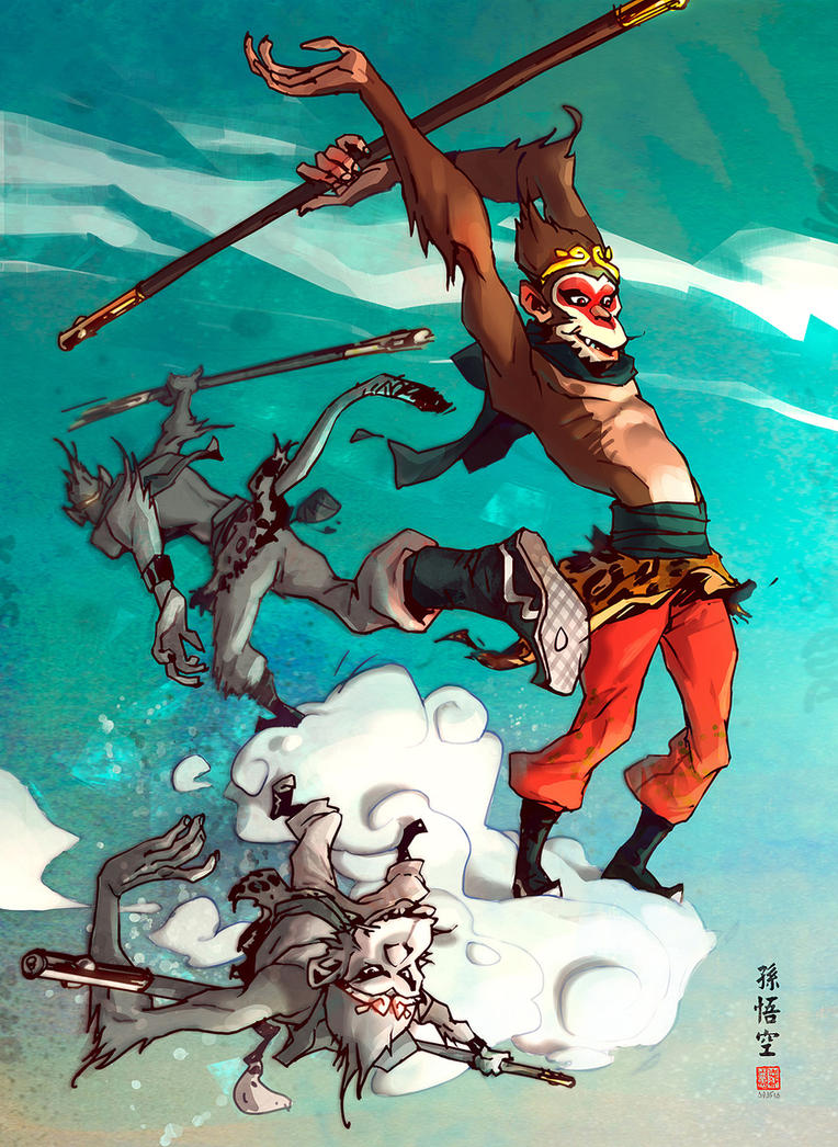
I have chosen to use the story of IRON Monkey, but develop it further to become my own original character. Realistically thinking, having a frustrated hero find his own style would take a very long time. Here are a few problems I have come across.
(1) A detailed research on martial art poses would be needed. And a really detailed planning.
(2) I've been studying the movements of drunken fist, watching Jackie Chan and Jet Li documentaries that conveniently aired on TV. It seems impossible to illustrate so many sudden movements for my future animators to follow.
(3) PLUS having a hero you would need enemies, being a true HERO you wouldn't have one enemy either, you would have a few. Just thinking of modeling and rigging that many characters becomes an annoyance.
I have to remember I have a time limit. So drastic, changes would have to be made.
________________________________________________________________ Heres a few characters I based my monkey on:
The artist herself is a freelance artist from the US. I love the way her character designs give off this bizarre deformation, but because of her unique colour palette, the characters come out extra ordinary. The character themselves have lanky features with big heads which look too heavy for the skinny necks to hold up.From colour compositions, and perspectives, the characters all establish their own unique presence on the pages. Shes also very fluent with life drawing. Something I've been practicing all summer, so its quite cool how shes used her life drawing skills. I'm finding it easier to spot out which artists actually have experience and which doesn't. It really does stand out in our drawings. Even IF they're stylized.
(Since this is her own personal blog+ portfolio I thought it would more polite to put the link up)
Since her characters are based on simple blocked shapes with stick thin limbs I gave this style a try and came out with this: [Character Development Page] Features I kept in mind: Blocked heads, small shoulders, slightly wider waists and feet just as big as the head.
Was a great experience, experimenting with other people styles. But I'm still not comfortable drawing with this kind of style. I think more time and practice would have to be put into this if i was to continue developing stylized drawings similar to this. Since I'm still looking for my own drawing style, Its crucial I try a bit of everything! =)
______________________________________________________________ This was truly one of the most inspiring piece of animation I found through the summer. It was made by a Japanese animation student I believe. There isn't much about the artist, or the piece of animation. Sadly, the piece was untitled. And was self made. It took the artist half a year as stated here: 途中ですが、間に合ったのはここまででした。無念です。 製作期間2008~2009。実質半年くらい?
Translated:: It is in, and had made it this far. This is regrettable. 2008 - 2009 production period. Virtually half a year?
Youtube username: outsiders03
This was amazing to watch, especially the music, it immerses the audience into the animation. A very good example in how important music is to an animated piece. I've also found many animation students around the world practices animation using balls morphing into objects/ characters. Its a shame we never got to do that for first year. But perhaps, I could incorporate that into my pitch some how? The simplicity of the piece is kind of weird, it doesnt seem like a finished piece and yet it does in another way. I think its because it only uses two colours and various tones of the same colour to capture lighting. Which reminded me of a line animation Jared showed us last year, that was apparently award winning. It makes me wonder if animating my piece in 2D would be a wise choice, since it would give me the chance to draw more on paper.