Tuesday, 1 February 2011

Practice..Practice..Practice...

Trying to imitate digital calligraphy is no joke. Having to play with so many settings to try getting these strokes right is really beginning to turn into a pain. However, I believe WE FINALLY HAVE SOME RESULTS!!

Heres a practice I went through to get the grips of painting the narcissus flower. As you can see, I changed the middle of the flower similar to a narcissus flower. Theres a long way to go. But I'm sure we'll get there^^

I've been watching some video's on YouTube on calligraphy. Most of the videos are in Mandarin.. lucky i can understand a some, and actually read some subtitles in TRADITIONAL Chinese^^ The theory and mindset of actually applying the paint goes on very deeply. Its no wonder 9 year olds can paint like geniuses. It becomes an obsession!


Children being trained from young! Then effortlessly shame the rest of the world! How I'd love to go to such a meaningful art school =)

Heres a more in depth study of how people are supposed to apply paint to the massive paint brushes for that authentic effect.


It gets very complicated with the amount of water..ink... paint... n so on... on each PART of the paint brush. And WHERE to add more water ..(above or under) the ink/ paint. and HOW you would then apply this to the silk canvas/ paper. It makes me miss holding a paintbrush.. instead.. I have a stylus and smudgeguard on =) Working like a professional digital artist! (aiming to anywayz.) =D


Saturday, 29 January 2011

Image sizes!


We've all been assigned our real jobs and tasks for the term^^ Not completely but me and Michelle have a fair bit of work to share between us! =D

We're supposed to be working on the intro scene to SMITTEN, But the project file Matt uploaded to A-Drive seems to be for Premiere Pro, so we havent been able to work on the shot since the layers have been clearly drawn out in the working animatic.
Instead, we've been working on the separate backgrounds we allocated ourselves during the holidays. I've been trying to work out the measurements for the panning shots in the forest.
Our image sizes would be 1080x720, However, the panoramic would obviously be much longer.
I collected the 3 main points from the colour script in which Matt has imagined the shot to look like. the camera moves slightly higher at the end of this shot. MEANING, the image would have to be slightly higher then I imagined. I worked out, the image would be 3 times wider then its original size, and about a 3rd higher then 720.

so... 720 divided by 3 = 240,
720+240= 960
1080x3= 3240

so our new measurements theoretically will be........ 3240x960!
/i will go over this with the team, then come up with a final decision, since the measurements haven't been officially decided yet.

Monday, 17 January 2011

Brush Test

After an in depth study of different chinese artists and the methods they use, I then created this..
As you can see the black outlines are less harsh as before, The MayFly's outlines is also in moderation, didn want to over do it so I copied the way I coloured it in the first concept image of it. (The blue one) I feel as though, the mayfly would need a second tone. In the original concept, I gave it a purple tint to work along aside the blue for that ghostly feel. However, I've done a few tests, and adding greens.. purples.. or blues still look kind of weird. The only look that was acceptable was to go down a browner route.

Monday, 10 January 2011

Textures...

I'm currently working on different ways of portraying a very patchy look for the stone walls. I remember watching Grand Design with Kevin McCloud explaining out different coloured cements used would give a castles outer appearance alot of difference. He was applying different mixtures of with different amounts of line stone in it etc. So I decided, since we're aiming to NOT use any outlines for the backgrounds. I figured, we could use LIGHTER colours of the same shade of the objects as the outline colours. And heres the outcome. It doesn't look too bad actually, I might play around with a slightly different tone. Like, a tint of purple perhaps?

Its a shame this unit has "ended" but continue to upload my progress in the same way. =D
I've found its helped me with my creative thinking since I'm logging the progress. Its nice to see what I planned to do, and actually finished, and how its helped my projects advanced.^^

Sunday, 9 January 2011

Okami VISUALS!!

During our meeting on the MAYFLY project, me and Iredia both agreed, Okami the PS2 game from years ago was a very inspiring and one of the most successful games which used painted brushes to express outlines and the characters authenticity, as the design linked to asian themes.

http://dayfly89.blogspot.com/2011/01/styles-to-work-with.html

watercolours:


Thicker Ink lines:


other styles with less dominating calligraphy lines.


Iredia has done a brief visual analysis of several images from Okami. I'll carefully studying each point to try grasp his visual despair. We still haven't decided on the final look for the background. And since we've both decided to use TVPAINT ONLY, its been a long journey to even creating acceptable images. I've grasped some basic skills from tutorials, and have even gone through forums for the Chinese paint brush textures. But actually controlling the brushes has become a bit of a challenge.

As you can see here ::


I did this as a quick test of the calligraphy brushes, It came out quite well! The Mayfly would obviously not be animated in such thick brush strokes but more consideration in how we portray this character is needed. This would all be determind after I've finished the other tests this week.

I even went over one of iredia's flight tests for the mayfly. Originally, I was given a folder that was over 300 frames long!! But then after looking through them, 200 odd frames were in fact empty! So that was a relief. I know its not something to complain about, since the final thing will probably have thousands of frames to go over!

Heres the Test animation with the brushes. Its not visually amazing, but its a start for the overall FEEL for the atmosphere.


After having a video conference with Iredia over our progress and so on, I pointed out, the character IS pretty flicky. He has mentioned we would be the only group with that traditional flicky feel from our project. But this seemed too much. I went over the MAYFLY character with a THICK brush, I personally didnt find it convincing, it was probably because the frames were so fast, the audience don't have the chance to even see the textures let alone study it.

Another thing is, Iredia pointed out the Mayfly animation was alot faster then his original test. And I couldnt figure out why, I sent him the project file for him to check out.
I totally forgot about the basic settings, from the fps and size. I've noticed, after drawing for long hours, my technical thinking don't come in, so i'll have to keep that in mind before I render out scenes in the wrong settings! = wasting our precious time!

-----------------------------------

I actually got this feedback from him:

"hey yuki i figured out the problem- the import settings you had were 30 frames per second, so because the animation is 24, it cut out certain frames & also sped it up- I've done a correct settings import with the frames cut to the exact right time that the animation stops- so i'll send this 2 you asap. so hopefully sometime this week, (give it a few days break after today of course), you can have one more go?

here are specific changes I feel need to be made for the next attempt:

*As little flickering as possible with the colouring (this may mean you need to really zoom in on the frames to make sure
that paintings are as close to each other as possible)- so that the painting matches the smoothness of the animation.

*no black outlines on the character - when they flicker its really obvious and distracting- I want the outlines similar to your 1st mayfly painting you showed me, coloured so they blend in well with the colour of the mayflies body- (if this means you need to ditch the Chinese brushes for the characters body then do so- as long as we can have them in the awesome background you're gonna create).

I hope I'm not giving too much, if so please let me know- I just wanna make sure we're fully ready to start producing the film come the 24th "


"by the way don't do this for all 109 frame because I feel that may be a bit unfair, considering you did so well to attempt to tackle the whole thing today :D may b up to frame 56 Max "

and I replied with:

"ooOOO!!!! Forgot to set the settings xD My bad xD And dude, its ok, its understandable. I'll have another hack at it next week =D And the 109frames wasn't so bad actually =O I'll try get that done, don't worry =D "

Since I've chosen the route as an animation student, I have no time for excuses, its a path I've chosen myself, something I chose to ENJOY. And I really didnt feel much "pain" in going over someone elses animated frames. I actually have the feeling of correcting a few frames at the same time. Its a tedious job, but its also something I've agreed on. I can't let my team down, since Iredia's working just as hard on secondary effects such as water splashes, a challenge I would dread to do. Much respect for them water effects, as a fellow animation student I feel motivated to work even harder for him.^^

AND GOOD NEWS, I just received some Chinese books on the arts of Chinese painting, with some basics and some in depth thoughts from many famous artists. Its hard to read since its in simplified Chinese, Its like trying to read Shakespeare English!

So heres whats been decided for the next week:
-I'll be working on CONCEPTS directly on TVP
-I'll be working on diff ways of animating in TVP with an moderate usage of the thick lines.
-I'll also be animating the test again WITHOUT outlines so that it hopefully, cancels out the flicky feeling of my first test.

Wednesday, 5 January 2011

some visual's from the 4th.


Some proof me and Michelle finally got skype working!! As you can see in the print screen above. YOUR actually looking at MICHELLE's monitor, thats viewing my computer at home =D
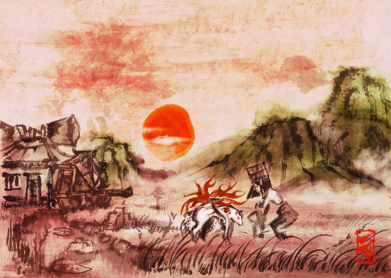
Heres a sketch of the wonky castle as Matt requested =D Its slightly abstract. We decided not to push it so far, so here is the outcome. As you can see, Matt loved my idea of keeping the princesses tower the tallest and the ONLY tower with a cone. So that element stayed. Truthfully, only the shaped and perspective of the design changed. Its a small simple castle thats not meant to have a massive impact of the audience for its size, but for the crazy-ness that happens inside after. I predict it should have the same feeling as watching alice and wonderland. The contrast of a little person stepping into a massive world. or the other way round. Its going to look like its a really small area, where not much is possible, but really its going to portray a whole lot more.

On the right hand side, I've suggested another design element that we could use. For the tiled floors and banners, we should incorporate our initials or something to form a logo or something? Afterall, its our master piece. Even the Pixar animators did the same. They all learn their basic skills in a room named A113. And included that very code name in almost all their movies. =D


Heres the front and a more 3D view of the castle, Its not symmetrical, which is the main aspect of its design. Just like the castle in Cindarella.

Here's the 3D block out Michelle made during term time =D

Here's my initial sketch I worked on through the Christmas holidays, I realised me and Michelle only discussed the interior of the ENTRANCE instead of the WHOLE entrance hall itself. As a room, it should have a minimum of two doors. As we debated whether we should add more character to the interiors design, we soon realised, most medieval interiors have ARCHES, and plenty of them!. So I carried on sketching LIVE on skype as Michelle carried on giving suggestions. We then decided the 3D block out Michelle made would need updating to help us along with the perspectives. And this was the result:
I'm pleased with the speed and accuracy we both had in managing our designs. It truly shows our potential as artists!^^ As Michelle corrected the camera angles I opened the storyboard so she could use as reference at the same time. [ As you can see on right hand side]


Here's the sketches I did over the holiday! I got most of them from referenced photographs of medieval doors and buildings. And alot from watching sleeping beauty, and sword in the stone.

Perspective Study:


"We decided to try and attempt creating the entrance hall, so we met on Skype and spoke about what direction to go in, and watched clips from 'The Sword in the Stone' and 'Sleeping Beauty' to get a good idea of castle interiors and perspective;"
(Taken from michelles blog)


All for of these images were made BY Michelle through the guidance of my initial sketches of the interiors. For this following week, we'll be tweaking these backgrounds together to form a collaboration of skills, this should technically give a very unique visual appearance in comparison to our past work.


Here are some of Matt's moodboards we try to work close with.


Our colour script came from most of the selection above, so studying the way scenes were texture in Sword in the stone and sleepy beauty was an essential step.

Michelle has also been watching BBC's newest series "Merlin". Matt has also agreed its the perfect setting for our film. I personally havent watched it yet, but I will soon.
The series was filmed at the Château de Pierrefonds in France. heres a few images of it.


Online painting Lessons

http://www.chinese-tools.com/learn/painting

A user on the official tvpaint website posted this link up on the same thread as where I found the chinese paint brushes on TVPaint.

credits to: gugu for the brushes =D

and TVPAINT tutorials:

http://www.tvpaint.com/v2/content/article/support/faq.php

I'll be working with these tutorials for the next few weeks, hope I master the basics of it before term starts =D